TextMate's Markdown Headings
One of the things I initially disliked about TextMate’s Markdown bundle is the way it handles headings inside the editor. I don’t mind the largeness of the elements – these are headings, chances are they are going to be large when rendered on a website or published in a document.
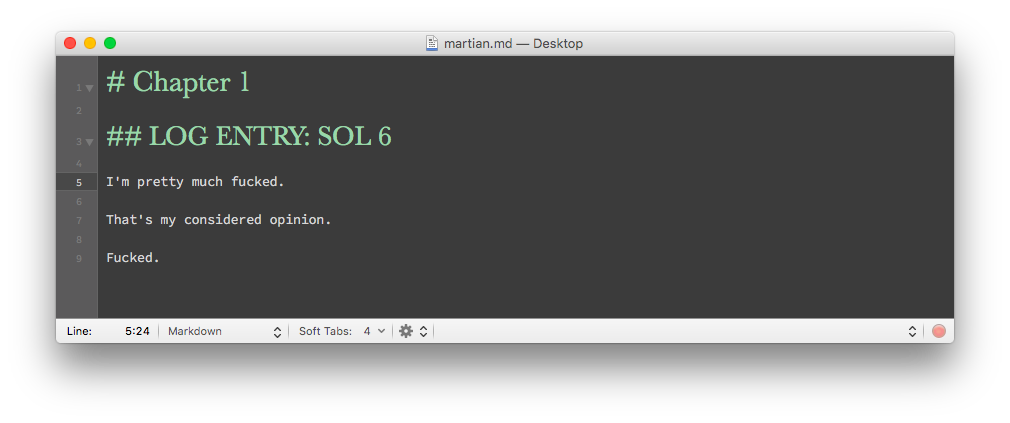
I cannot stand that font.
It just doesn’t play well with the monospace font I use, Office Code Pro. The headings look very thin, and I spend a lot of my time writing things in markdown. I can’t stare at these goddamn headings anymore.
Luckily, this is TextMate, so chances are there is a setting we can update to reflect my stubbornness.
Buried inside the “Themes” bundle 1 are a group of settings that control this, aptly named “Markup: Heading X”. Basically, each of these is a simple TextMate Settings file that sets options for selected scopes. 2
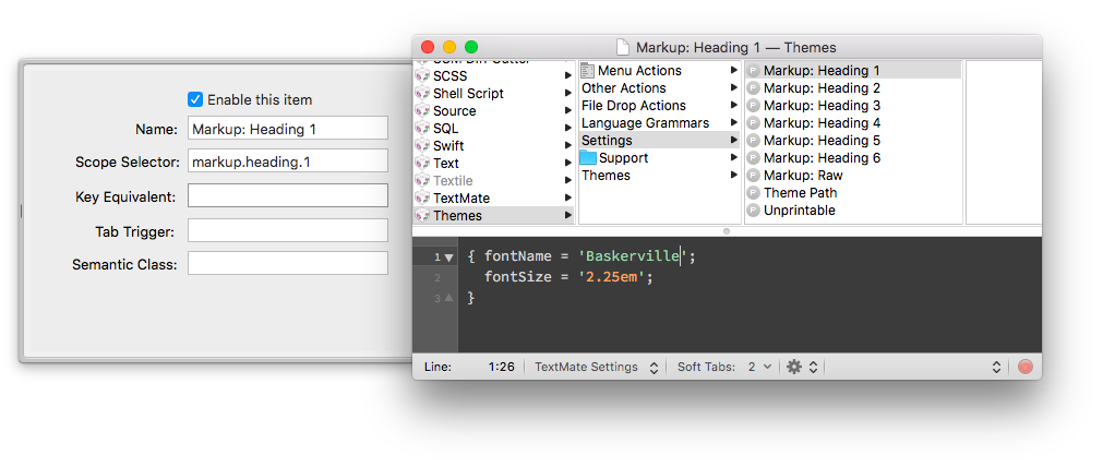
In the drawer on the left the Scope Selector is set to markup.heading.x. This tells TextMate to only trigger this setting when inside that particular scope. The setting itself is rather simple – all it changes are the fontSize and fontName attributes. It seems the perpetrator in question goes by the name “Baskerville”.
Well, time for a face lift. I’m going to change this to PT Serif, because in this blogger’s opinion, it’s a superior font in literally every way.
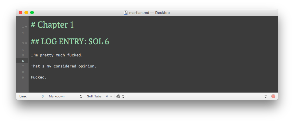
Just look at those pound signs. 3 Now that is a font worthy of a heading.
-
This is one of those default, meta bundles that comes preinstalled with TextMate. They typically contains items that other bundles use. For example, inside this bundle are the themes used to render the HTML output. ↩
-
Yes, I have written about TextMate settings before. Thanks for asking. ↩
-
Err… Hashtags, I mean. ↩